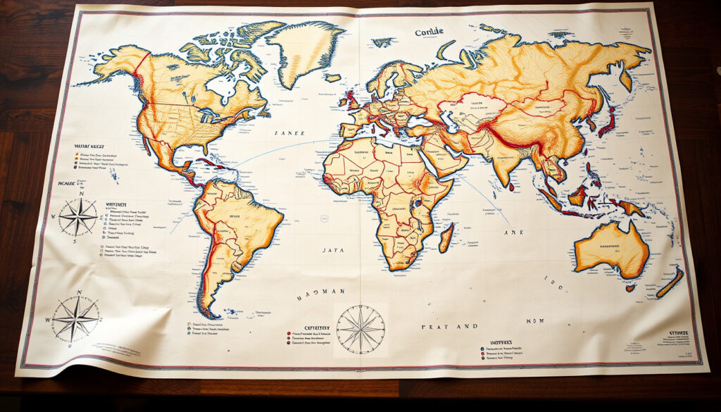
World Map with Names: Projections, Accuracy, and Facts
Anyone who’s ever glanced at a world map and noticed that Greenland looks roughly the same size as Africa has already bumped into the Mercator projection’s biggest flaw. That distortion is why picking the right world map with names matters more than most people realize, and this guide walks through the most popular world maps, the most accurate projections, and the key country facts you actually need — all with clear sources so you can see where the numbers come from.
Number of recognized countries: 195 ·
Most common world map projection: Mercator ·
Smallest country by area: Vatican City (0.44 km²) ·
Oldest continuous state: San Marino (est. 301 CE)
Quick snapshot
- The United Nations recognizes 195 sovereign countries (UN Member States).
- Vatican City is the smallest country by area at 0.44 km² (CIA World Factbook).
- The Mercator projection strongly distorts areas at world scale (ICACI factsheet).
- Which world map is “most beautiful” is subjective and not scientifically defined. (Britannica)
- The exact oldest continuously existing country is debated; San Marino is often cited, but others claim earlier origins (Britannica).
- The best map projection for general use is a matter of compromise; no single projection is perfect (ICACI factsheet). (Britannica)
- Mercator projection created in 1569 for navigation (EU Data Visualisation Guide).
- National Geographic adopted the Winkel Tripel projection in 1995 (Science Insights).
- Equal Earth projection introduced in 2018 as a modern equal-area standard (NASA GISS).
- Equal-area projections are recommended for communicating area-based data like land cover or climate (ICACI factsheet).
- Web maps are increasingly offering projection options beyond the default Mercator, as recommended by the ICACI factsheet. (ICACI factsheet)
Summary of key facts — note the extremes that surprise most people.
| Label | Value |
|---|---|
| Total Countries | 195 |
| Most Popular Projection | Mercator |
| Smallest Country | Vatican City (0.44 km²) |
| Oldest Country | San Marino (est. 301 CE) |
| Most Accurate Projection (compromise) | Winkel Tripel |
The pattern: these extremes highlight the diversity of countries.
What is the most popular world map?
If you search “world map with names” on any search engine, the Mercator projection dominates the results. It’s the map most of us grew up seeing in classrooms, on news graphics, and inside Google Maps. But its popularity comes with a trade-off that’s worth understanding.
What is the most famous map?
- The Mercator projection is the most widely recognized world map. Its main advantage: straight lines on the map represent constant compass direction, making it invaluable for navigation (EU Data Visualisation Guide).
- Google Maps uses a variant of the Mercator projection (Web Mercator) for its zoomable interface, which keeps angles true at street level (Science Insights).
- Popular world maps also include political styles (showing borders and capitals) and physical styles (showing terrain). Political maps are the default for general reference.
What is the most beautiful map in the world?
Beauty in cartography is subjective. Some point to the Waldseemüller map from 1507 — the first to use the name “America”. Others love the artistic Mappa Mundi in Hereford Cathedral. Modern designs like the Peters projection gained fame for correcting area distortion, though its aesthetics divided opinion. As the ICACI factsheet notes, the “most beautiful” claim has no scientific anchor — it depends on what you value: shape accuracy, area fairness, or historical charm.
Mercator’s popularity is real, but it treats area unfairly. A reader searching for a “world map with names” today should ask: is this for navigation (where Mercator excels) or for understanding the true size of continents (where it fails)?
The catch: choosing a map for its look alone ignores its projection’s distortion.
What is the most accurate world map?
No map projection can perfectly flatten a sphere. Every choice involves compromise. But some projections minimize distortion better than others, and the answer depends on which kind of distortion you care about most: area, shape, distance, or direction.
Which is the most accurate world map?
- No single projection is correct for all purposes because flattening the globe always introduces distortion (ICACI factsheet).
- The Winkel Tripel projection is widely considered the best overall compromise for general-purpose world maps. National Geographic adopted it in 1995 (Science Insights).
- For equal-area accuracy, the Equal Earth projection is a modern standard — it preserves the relative size of landmasses (NASA GISS).
When educators print a “world map with names” for a classroom, they risk reinforcing size misconceptions if they pick Mercator. A child seeing Greenland as huge will grow up thinking it’s comparable to Africa — which is actually 14 times larger. Choosing an equal-area projection like Equal Earth or an accurate compromise like Winkel Tripel fixes that.
The implication: accurate projections are not about perfection but about matching the map to the task.
How many countries are in A to Z?
Counting countries sounds simple, but the number varies depending on who’s counting. The most widely accepted figure comes from the United Nations, which lists 195 sovereign states. Two extremes — the oldest and the smallest — add texture to that number.
What is the oldest country in the world?
- San Marino, founded in 301 CE, is often cited as the oldest continuous sovereign state (Britannica).
- Other contenders include Japan (660 BCE per legend) and Iran (c. 3200 BCE), but continuous statehood is harder to verify. San Marino’s claim rests on unbroken independence since the 4th century.
Which is the smallest country in the world?
- Vatican City, at 0.44 km², is the smallest independent state by area (CIA World Factbook).
- It is an independent city-state enclaved within Rome, Italy, with a population of around 800.
What are all the map names?
“Map names” can mean two things: the names of different map types (political, physical, interactive) or the names of projection families (Mercator, Robinson, etc.). Both are valuable when choosing a world map with names for a specific need.
What are the different types of world map projections?
- Mercator – conformal (preserves angles); distorts area severely at high latitudes.
- Robinson – compromise projection; looks familiar, balanced distortion, used in many textbooks (Yale quick guide).
- Gall-Peters – equal-area; accurately shows country sizes but stretches shapes near the equator.
- Winkel Tripel – compromise; balanced across area, shape, and distance; National Geographic’s choice.
- Equal Earth – equal-area; modern, pseudocylindric, and recommended for thematic maps (NASA GISS).
- AuthaGraph – equal-area; very low distortion; preserves relative sizes and shapes (Science Insights).
What is a political world map vs physical world map?
The following table contrasts political and physical maps.
| Type | Shows | Best for |
|---|---|---|
| Political world map | Country borders, capitals, major cities | General reference, travel planning, education |
| Physical world map | Terrain, mountains, rivers, deserts | Geography lessons, understanding landforms |
| Interactive world map | Zoomable regions, clickable labels | Online exploration, real-time data |
| World map with names PDF | Printable with all country labels | Classroom walls, office posters |
The trade-off: political maps emphasize human boundaries, while physical maps show nature’s layout. A classroom might want both — a political map for capitol memorization and a physical map for understanding why rivers form borders.
Which is the smallest country in the world?
We already mentioned Vatican City, but it’s worth zooming in. With an area of just 0.44 km² (roughly 44 hectares), it’s smaller than many city parks. It operates its own postal service, has its own flag, and issues its own passports — all from within a walled enclave in Rome. The 2021 census counted 764 residents (CIA World Factbook).
Despite being a country, Vatican City is not a UN member state — it holds permanent observer status. So if you’re counting “195” from the UN list, Vatican City is not in that number. The UN includes 193 member states plus 2 observer states (Vatican City and Palestine).
Five projections, one pattern: each sacrifices something to preserve something else.
| Projection | Type | Distortion strengths | Best use |
|---|---|---|---|
| Mercator | Conformal | Preserves angles; strongly distorts area (poles) | Navigation, street-level web maps |
| Robinson | Compromise | Balanced; no property perfectly preserved | Classroom wall maps, general reference |
| Gall-Peters | Equal-area | Accurate area; shape distorted near equator | Thematic maps showing land cover or population |
| Winkel Tripel | Compromise | Low overall distortion across area, shape, distance | General-purpose world maps, National Geographic |
| Equal Earth | Equal-area | Accurate area; pseudocylindric, modern | Climate, land-cover, statistical maps |
| AuthaGraph | Equal-area | Very low distortion; preserves relative sizes and shapes | General reference, world maps |
The implication: there is no single “accurate” world map. The right choice depends on whether you need true size (pick equal-area) or true shape (pick conformal). For most readers who want a “world map with names”, a compromise like Winkel Tripel offers the best overall balance.
Four formats, each serving a different context.
| Type | Description | Best For | Example |
|---|---|---|---|
| Political map | Countries, borders, capitals, cities | General reference, travel planning | Worldometers political map |
| Physical map | Mountains, rivers, elevation | Geography education, hiking | Geology.com physical map |
| Interactive map | Zoomable, clickable, often with layers | Online exploration, research | Google Maps, NASA Worldview |
| PDF labeled map | Printable, fixed scale, all labels | Classroom posters, office displays | Nations Online map PDFs |
The pattern: each format trades dynamism for simplicity. A PDF is static but reliable; an interactive map is flexible but needs a screen. For a classroom that needs a durable reference, a political PDF world map with names remains the go-to.
“The Winkel Tripel projection is a good compromise for world maps because it reduces distortion of area, shape, and distance.”
— National Geographic cartographer, as reported by Science Insights (2026 explainer)
“Straight lines on the Mercator map represent constant compass direction — that’s why sailors still rely on it.”
— EU Data Visualisation Guide on map projections (EU Data Visualisation Guide)
For teachers, travelers, and data analysts, the choice of map is not trivial. Using an equal-area projection for climate data or a conformal one for navigation can make the difference between a correct analysis and a misleading one. The next time you search for a world map with names, consider what you actually need the map to do — and pick the projection that matches your purpose.
iogp.org, link.springer.com, history.yale.edu, geoawesome.com, lib.bsu.edu, unanswered.io, math.univ-lyon1.fr, library.oarcloud.noaa.gov
Frequently asked questions
How do I read a world map with names?
Start by locating the compass rose or orientation (north is usually up). Then read the legend to understand colors and symbols. Country names are typically written inside borders; capital cities are marked with a star or dot.
What are the benefits of using a world map with labels?
Labels help you quickly identify countries, capitals, and geographic features without having to cross-reference a separate list. This is especially useful for students, travelers, and anyone learning geography.
Can I customize a world map with names?
Yes. Many online tools (like MapChart or Canva) let you create custom maps with your own labels, colors, and highlights. You can also buy blank wall maps and write on them with markers.
Where can I find a free world map with names for printing?
Sites like Worldometers, Nations Online, and Geology.com offer free printable PDF world maps with country names. Ensure the license allows classroom use if needed.
What is the difference between a world map and a globe?
A globe is a 3D sphere that represents the Earth without distortion. A world map is a 2D flat representation that necessarily distorts area, shape, or distance. Globes are accurate but less portable.
Why do world maps look different?
Because map projections differ. Every projection distorts at least one property (area, shape, distance, direction). The Mercator looks very different from the Peters projection because they preserve different things.
Are world maps with names suitable for classroom use?
Yes, but choose the projection carefully. For a general classroom, a Winkel Tripel or Robinson projection political map offers a good balance. Avoid Mercator for teaching true continent sizes.
Related reading
- Great Wall of China Map: Start, End, Satellite View & Key Cities — a detailed guide to one of the world’s most famous landmarks, with satellite imagery and city references.
- Southern Lights New Zealand 2026: Aurora Australis Viewing Guide — learn how to read aurora maps and plan your trip to see the Southern Lights.
More related posts
 Pink Shirt Day 2025 – Date, History and Participation Guide
 Wellington Breaking News Today: Live Updates, Safety & Suburbs Guide
 South New Brighton School: Uniform, Decile, Term Dates & Fees
 Dr Brown Bottles NZ: Sizes, Prices, and Buying Tips
 Liverpool vs Newcastle United Lineups: Confirmed Starting XI
 Property Brokers New Plymouth: Houses, Rent & Real Estate
 Māui and the Giant Fish: Māori Legend Behind NZ’s North Island
 Snap Fitness Membership Prices in Ireland: €37.99 Month-to-Month